FOSSICK Magazine
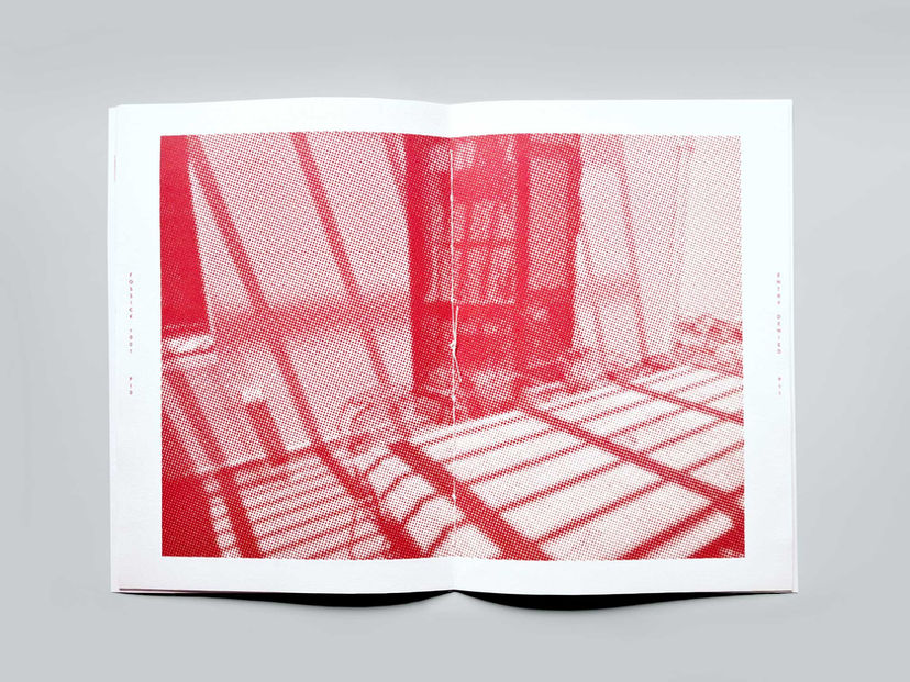
For this university assignment, we were tasked with creating a magazine targeted primarily at an audience of graphic designers and other creative professionals. FOSSICK Magazine aims to sift through contemporary design in order to shine a light on notable or successful works, as well as interesting or important critiques within academic design discourse.
The first issue of the magazine, titled “Entry Denied” features an animated AR cover, and explores the ways in which typography (and by extension, the wider world of design) can be used to restrict and confine individuals as well as highlight historical examples of restriction in the world of design.
2021
TYPOGRAPHY
AR
MOTION GRAPHICS

FOSSICK features a limited colour palette, and embraces the constraints of the underlying grid structures to inform design choices around typography and layout.
The magazine was printed and hand-bound using saddle stitch binding. For an engaging tactile experience, the cover of the magazine was printed on 215gsm matte felt stock while the inside pages were printed on a thinner 90gsm stock.
All signage vector illustrations and photographs are my own.
To view the animated cover in AR:
Please scan the QR code to download / open the EyeJack App (it's free!)
-
Point your camera at the physical front cover, or an image of the front cover (such as the one provided)
-
Watch the cover come to life :)

A5 insert — article The Elements of Typographic Style by Robert Bringhurst


